Redesigned Clacky’s Homepage Around One Promise, on a Design System Built From Scratch.
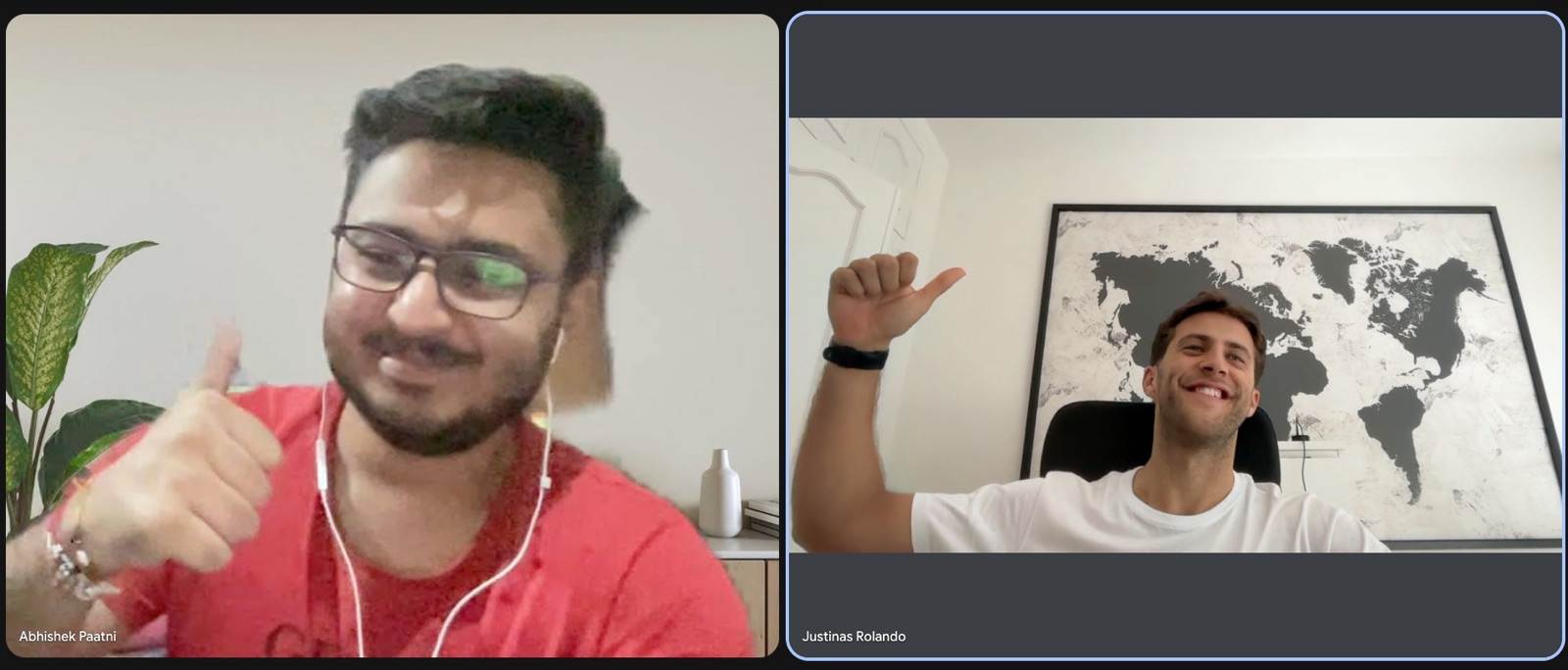
A conversion audit of clacky.app, a playful Mac app by solo maker Justinas Rolando, followed by a new hero and design system that put one promise, the real product and the trial terms in the first screen.
- Product
- Clacky, a Mac app by Justinas Rolando with click sounds, a screen recorder, Mac utilities, a cozy town game, analytics and a post scheduler (as audited)
- Role
- Strategist, Designer and Developer
- Timeline
- Audit 19 Oct 2026; brief, hero and design system 20 Oct 2026
- Project type
- Conversion audit and hero redesign
- Built with
- Plain HTML, CSS and a little JavaScript, with no framework or UI library, deployed on Vercel
- Deliverables
- A 4 page conversion audit, a copy and visual design brief for the whole homepage, a live hero section and its design system
- Built to move
- +15 to 25% hero CTA click through; 10 to 20% fewer checkout drop offs; +20 to 30% CTA taps on phones, against the page as it was on 19 Oct 2026
- Note
- clacky.app has since changed its offer, so the hero’s trial and price copy reflects the page as it was on 19 Oct 2026
Summary
Clacky launched on 28 September 2026 as a Mac app with click sounds, a screen recorder, notch tools, a cozy town game, analytics and a post scheduler. People loved its playful website, but by mid October new trials had slowed to a trickle.
Abhishek read the page at desktop and phone width, the trial page and about 220 of Justinas’s posts, wrote a conversion audit, then turned its top fixes into a copy and design brief and a new hero with its own design system.
The problem
- The promise said everything. The headline covered “everything you make”, and the subhead listed sounds, a recorder, 20+ tools, analytics and a harbour town.
- No product in the first screen. Desktop showed an illustration; on phones the subhead was hidden, so the hero was a headline and a button.
- The card requirement was hidden. The button said “7 days free · cancel anytime”; the card appeared only on the trial page and in FAQ 8 of 12.
- The page was long and leaky: about 15,000 px on desktop and 28 screens on a phone, with the next button after the hero some 15 screens down.
- Deciding facts came late. Pricing sat before the competitor comparison, and the macOS requirement was in the FAQ, 82% down the page.
What he changed
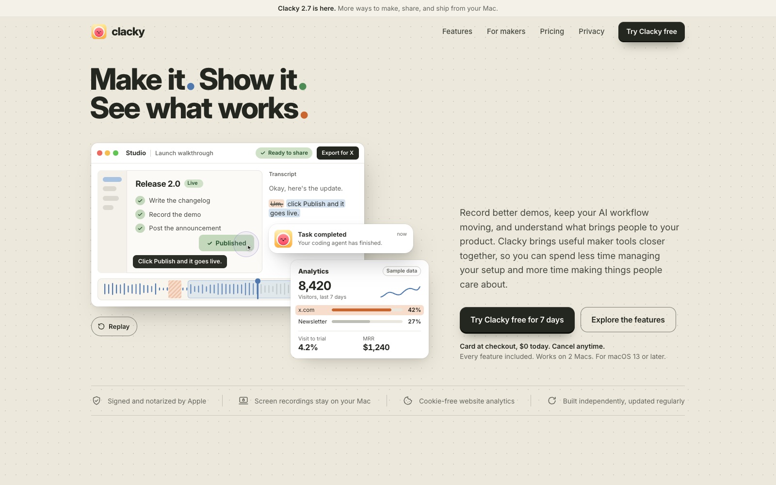
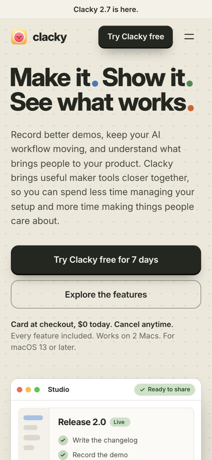
He gave the hero one story for one kind of visitor, makers who build and share from a Mac: make it, show it, see what works. The real product sits in the first screen, and what a visitor needs to decide sits beside the button.
Key moves
- A headline that ties the features into one workflow: “Make it. Show it. See what works.”
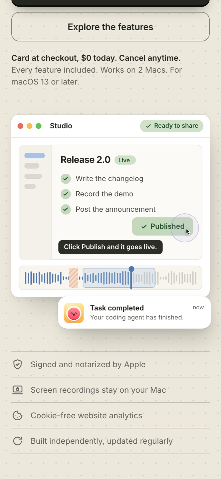
- A Studio window that turns a screen recording into a captioned, ready to share demo, playing once and ending on its final frame.
- A small “Task completed” notification and an analytics panel labelled “Sample data” as supporting proof.
- Trial terms beside the button: “Card at checkout, $0 today. Cancel anytime.”, every feature included, 2 Macs, macOS 13 or later.
- The trust strip kept right under the hero: notarized by Apple, recordings stay on your Mac, cookie free analytics.
- A shorter navigation (Features, For makers, Pricing, Privacy) and, on phones, a menu, a header button and the full explanation.
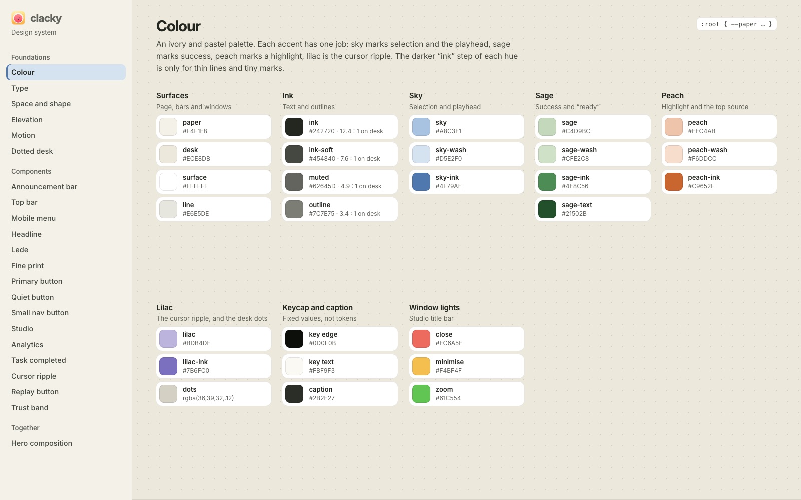
- A design system page with every token and component, where each accent colour has one job.
- Visitors who prefer reduced motion see the finished state straight away.
The result
A live hero and design system at clacky-hero.vercel.app, plus a brief with copy for all 17 homepage sections.
It is built for 15 to 25% more hero clicks, 10 to 20% fewer checkout drop offs and 20 to 30% more taps on phones, against the 19 Oct page.